Simplify the user decision path while preserving brand character.
User experience is primarily a problem of information architecture, task flow, feedback, error prevention and accessibility—not just screen aesthetics.
ALL INSIGHTS →
User Experience in Digital Products
On a website, SaaS product, dashboard or mobile app, the user should first understand what to do. Strong UX reduces decision load by showing the right information at the right moment.
User Experience in Digital Products
User experience is primarily a problem of information architecture, task flow, feedback, error prevention and accessibility—not just screen aesthetics.
Information hierarchy shortens decision time.
Users should understand where they are, what is being offered and which action has priority on the first screen. Visual hierarchy serves this decision path.
User flows come before a list of screens.
Primary tasks such as membership, booking, quoting, payment or content generation should be modeled step by step before screens are designed. Otherwise teams produce unnecessary pages and repetition.
Interactions need real states.
Buttons, filters, forms and menus should not remain decorative controls. Open, closed, loading, success, error and empty states need to be designed so the system always communicates the result of an action.
Forms should provide the shortest useful decision path.
Every field should be questioned. Long forms can be split into steps; input type, autocomplete, error messages and mobile-keyboard behavior should be correct.
Dashboards should produce decisions, not information overload.
Instead of showing every possible metric, decide which decision the user needs to make. Priority KPIs, trends, alerts and next actions are visible; secondary detail opens when needed.
Accessibility is a quality standard.
Keyboard use, visible focus, color contrast, correct labeling and readable type sizes make the product more reliable for more people.
Analytics continue UX research after launch.
Event tracking, funnels, form abandonment, search use and error points show actual behavior. Post-launch data should iteratively improve design decisions.
CHECK THESE BEFORE IMPLEMENTATION.
On a website, SaaS product, dashboard or mobile app, the user should first understand what to do. Strong UX reduces decision load by showing the right information at the right moment.
- ✓Is the primary user task defined?
- ✓Is onboarding free of unnecessary steps?
- ✓Are empty/loading/error states designed?
- ✓Are all form fields really necessary?
- ✓Is keyboard and focus access available?
- ✓Does the dashboard highlight priority decisions?
- ✓Are primary events measured in analytics?
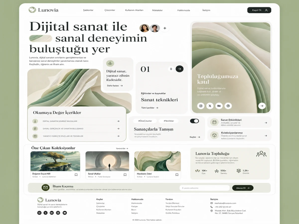
THE SAME PRINCIPLE ACROSS DIFFERENT INDUSTRIES.
Strategy, information architecture, visual system and conversion goals look different across brands; the underlying quality standard stays the same.

FREQUENTLY ASKED QUESTIONS.
Are UI and UX the same?
No. UI is the visual and interaction layer; UX covers the entire journey in which the user completes a task.
Should a SaaS product start with the dashboard?
Usually user roles, tasks and the data model should be defined first; the dashboard is a result of those decisions.
Can UX be improved in an existing product?
Yes. Analytics, user flows and current screens can be audited and improved progressively.
TURN THE INSIGHT INTO A SYSTEM.
We can clarify the needs, current infrastructure and priority conversion points together.
DISCUSS THE PROJECT →